Friday, May 31, 2013

Ink challenge winners!

Reminder - if you're interested in applying for our design team there are just a few days left! You can find the details in our side-bar here on the blog.

Now before I announce the winners - let me take a minute and thank Simon Says Stamp for another chance to win a $50 voucher!! Simon is supporting some great things for our blog - can't wait to share more!

Last week's challenge was all about ink - and as always the entries were fantastic. The lucky (randomly drawn) winner for the favorite ink challenge is...
 
111 Laurie Y

Please claim your prize within the next two weeks by emailing May.

  Now let's talk about the top 3 projects as chosen by the Stamp & Show design team. Everyone had so much great inspiration to share, and so many different favorite inks! One thing is for sure - there is no wrong answer to the question "what is your favorite ink?" This week the honors go to three incredible projects, all such different takes on the challenge this week:

9  Susan W
68 BarbaraYaYa
74 Meihsia Liu

Be sure to visit their blogs and check out their amazing entries. So inspiring! Congratulations to each of you on a challenge well done! Please email May for the Top 3 Blinkie.
 
I'd like to thank everyone who took part in the challenge. It is always a joy to see what you create. I'd also like to say thank you again to Simon Says Stamp for their generosity - each week we give away a $50 gift voucher to the shop that you can use to buy all kinds of fabulous stamps, inks, and paper crafting supplies.

Remember - you just need to enter the challenge each week to be entered into the drawing!

Wednesday, May 29, 2013

Into the Woods with Anna-Karin

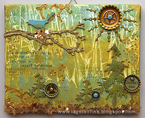
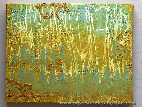
Hello everyone! Anna-Karin here with a tutorial for a mixed media board, using this week's 'Into the Woods' challenge theme as inspiration.
 
Through a forest wilderness-Layers of ink
I am a real forest person and forests are my favourite natural setting, if I could, I would walk or cycle in a forest every day. I wanted to do a board for my study which celebrates the beauty of forests, so that I can look up from my desk and find myself among the trees in a forest. I used a fun technique with plastic wrap and Distress Paints for the background, which gives awesome texture. I am also going to show some other techniques you can use to add texture to a project. It is a long tutorial, so let's start.


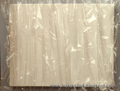
I used a mixed media board (8 x 10 in), but you could use watercolour paper or a canvas too, just place a book under the centre as support. Start by preparing a fairly large piece of plastic wrap by pulling it to form pleats or lines. Because of the forest theme, I wanted lines rather than completely random texture. You want to have this ready before the next step.


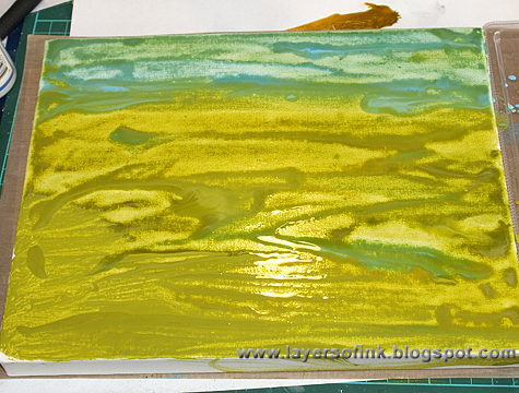
On a palette (I like to recycle plastic packaging for this), pour out a little pool of Peeled Paint and Salty Ocean Distress Paint, and a little bit of Adirondack Lettuce, or another lighter shade of green Distress Paint. You could add some yellow too if you want to. Add quite a lot of water to each pool of paint, you want the paint to be watery for the technique to work well. I used a Ranger Pipette to add the water, because it gives great control. Working quickly, start painting the green paints on the lower two-thirds of the board, using a paint brush. Dab the brush on a paper towel, but don't clean it, and quickly paint Salty Ocean at the top. The green that remains in the paint brush mixes with the blue to create a really nice colour and it also makes the colours blend better. Add a bit of blue paint here and there into the green too.

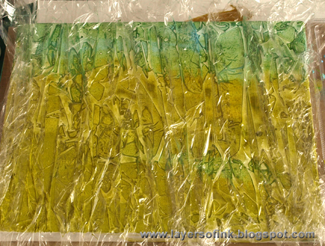
Immediately place the plastic wrap on top. If the paint has already started to dry, the technique won't work, so you got to be quick. Place a book on top and leave to dry completely. Don't peek! Check at a corner, if it isn't dry yet, leave it. If you remove the plastic wrap before the paint is dry, you don't get the same texture. This is the hard part, I am always tempted to peek.

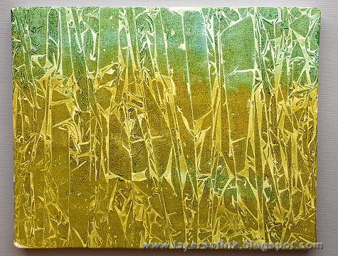
When the paint is dry, you will have this gorgeous texture. It will be different every time and I like techniques that give unpredictable results, since you never know what you are going to get. This technique works really well with Distress Paint, since they are pretty fluid.

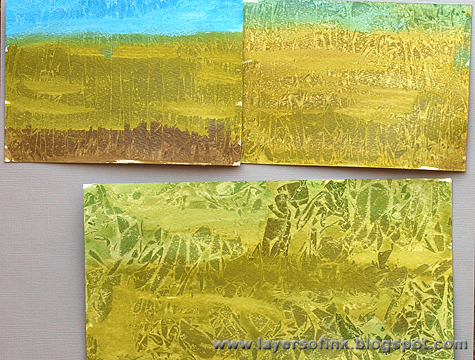
Here are a few other examples. On the paper to the top left, I didn't add enough water to the paint, so they haven't blended nicely and there isn't a lot of texture since the paint had already started to dry before the plastic wrap was placed on top. On the paper to the top right, I wrinkled the plastic wrap a lot, creating a finer texture. On the paper at the bottom, I wrinkled the plastic wrap into a ball, unfolded it and placed on the paper, creating a different type of texture.

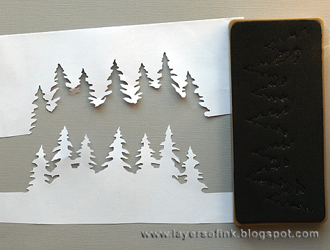
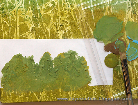
I wanted to add some trees to the background and die cut the Tree Line from Eclipse Tape, to create my own stencil/mask. To see more ideas of how to use your dies to make your own stencils, check out this tutorial of mine. Eclipse tape works great for this since it is self-adhesive and repositionable, but you could also use printer paper or a piece of acetate.


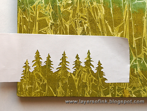
Place your stencil on the board where you would like to add some trees.

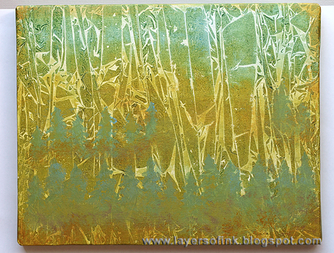
Mix Peeled Paint, Salty Ocean and a little bit of Walnut Stain Distress Paint, or use a colour such as Forest Moss. Paint your trees. Continue to add more trees. When the paint is dry, you can add more texture by dry-brushing a little paint on the trees.

I did a full row at the base, and added some trees further into the board too. I liked how they blended in with the background, if you want your trees to stand out more, use a darker green colour.

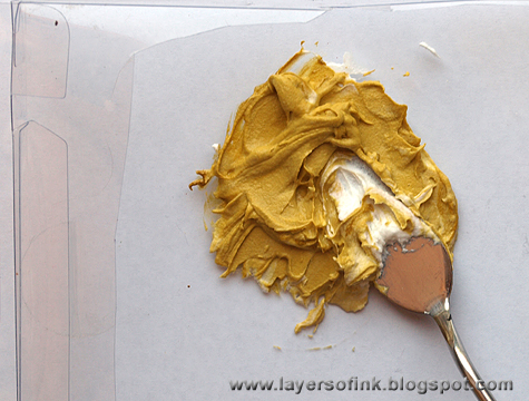
I love texture, and wanted to use stencils and paste too. Since I did not yet have Wendy Vecchi's Metallic Gold Embossing Paste when I made this, I mixed a little bit of Tarnished Brass into white paste. You don't want to add too much, because then the paste will be too fluid. If you have the gold embossing paste, use that instead, it is a fabulous golden paste.

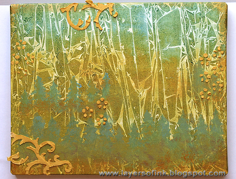
I made my own stencil with the Mini Flourish die and clear packaging and used a Prima Flower stencil for the little dot flowers. Apply the paste through the stencil with a palette knife or an old plastic card.


Leave to dry, when dry, I painted more Tarnished Brass on top of the paste. If you use the Metallic Gold Paste instead, you can skip this step. I also added some stamping with Archival Jet Black ink, using one of my favourite background stamps, from Tim Holtz School Desk set. I held it in my hand instead of mounting on an acrylic block for a random impression. I also painted some Tarnished Brass around the edges of the board.


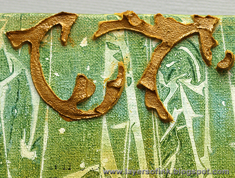
Here's a close-up of one of the flourishes.

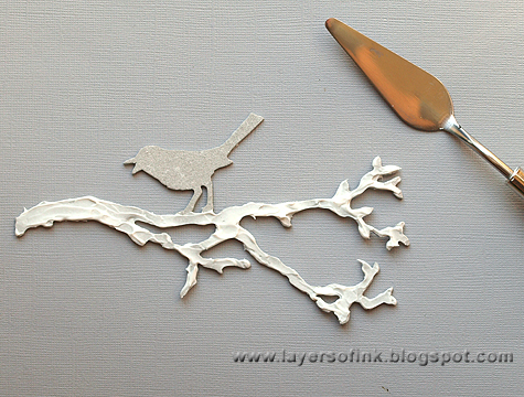
The board needed some life too, so I die cut the Sizzix Bird Branch from grungeboard and applied paste to the branches, using a palette knife. This gives great texture, and this project is all about texture.

When the paste is dry, paint the branch with Walnut Stain and Peeled Paint, adding highlights with Tarnished Brass. Paint the bird with Salty Ocean and Peeled Paint.


I wanted some moss on the branch and colorized Rock Candy dry glitter with alcohol inks (Lettuce, Meadow, Pesto). Tim Holtz shared how to do this last year, check out his post here. Apply Glossy Accents here and there on the branches and sprinkle glitter on top. Coat the bird with Glossy Accents too.

Die cut one large and two small pine trees from grungeboard and paint them with a mix of Peeled Paint, Salty Ocean, Walnut Stain and Lettuce. Dry-brush some of the darker colours on the trees after the paint has dried and add highlights with Tarnished Brass.


Stamp the trees with the same background stamp used on the background, aiming for a random impression.

Coat the trees with Glossy Accents and sprinkle just a little bit of the colorized glitter here and there.


I wanted some metal embellishments and liked the idea of using Prima's Bottle Caps, of transforming something that doesn't belong in nature, but often end up there because people throw bottle caps everywhere, into something warm and beautiful. I also used a bunch of Tim Holtz Idea-ology pieces: Game Spinners, Sprocket Gears, and a Philosophy tag. The little screw heads come from Prima. Most of the pieces were painted with Distress Paints which work fabulously on metal, smear some on your craft sheet and apply to the pieces with your finger. Two bottle caps were painted with Tarnished Brass and the other two with just a bit of Salty Ocean. Most of the game spinners were painted with Tarnished Brass, except for two which were painted with Peeled Paint and Salty Ocean. The screw heads were painted in different colours. The Philosophy Tag was painted with Peeled Paint and Salty Ocean and Black Soot was rubbed into the letters.

Here comes a fun part, embellishing the bottle caps. I made the large one into the life-giving sun, and the smaller three into trees. Glue the pieces down with Glossy Accents and add Glossy Accents inside the gears.

Time to assemble everything. Glue the trees and bottle caps to the board with Glossy Accents or hot glue. I used Game Spinners as trunks for the bottle cap trees. The trees needed a forest floor to grow from and Stampendous Gilded Mica Fragments were the perfect solution, with a beautiful natural shimmer. I applied Glossy Accents all along the base of the board and sprinkled mica flakes on top, pressing them down carefully with a piece of scrap paper.

Here's the third tree and bottle cap tree.

I made a little nest for the bird with mica flakes too.

The sun and all the rays were glued down with Glossy Accents. Love how this turned out.
I am fond of using quotes and there are quite a few beautiful quotes about forests by John Muir. I really love this one and I am happy to have it displayed on my wall now. It was stamped with Hero Arts alphabet stamps. There was some background stamping very close to the quote and I simply painted over it so that it wouldn't compete for attention.
Thank you for looking at this tutorial! I hope you enjoyed it, and don't forget to join us this week in the 'Into the Woods' challenge, for your chance to win a $50 gift voucher from Simon Says Stamp.
Happy crafting!!

Anna-Karin
Supplies:

Surfaces: Tim Holtz Idea-ology Grungeboard; mixed media paint board or canvas (8 x 10 in)
Dies: Sizzix: Bird Branch, Pine Tree, Mini Pine Tree & HollyOn the Edge Tree Line, Mini Flourish
Stamps: Stamper's Anonymous Tim Holtz: School Desk; Hero Arts: Printer's Lowercase
Ink: Archival Ink Jet Black
Alcohol ink: Adirondack: Lettuce, Meadow, Pesto
Paint: Ranger Tim Holtz Distress Paint: Peeled Paint, Walnut Stain, Antique Linen, Salty Ocean, Tarnished Brass, Black Soot; Adirondack Lettuce
Stencil: Prima: Sunrise Sunset Flower Stencil
Glitter: Ranger Distress Stickles Rock Candy Dry Glitter
Embellishments: Tim Holtz Idea-ology: Sprocket Gears, Mini GearsGame Spinners, Philosophy Tags; Prima: Sunrise Sunset Vintage Bottle CapsTiny Junkyard Findings Screw Heads; Stampendous: Gilded Mica Fragments
Medium: Stamper's Anonymous Wendy Vecchi Embossing Paste: White, Metallic Gold
Adhesive: Judikins Eclipse Art Masking Tape; Ranger Glossy Accents; hot glue

Monday, May 27, 2013

Challenge: Into the woods

Whether you’re a rugged lumberjack or out for a casual stroll in the woods, are inspired by adorable woodland creatures or want the chance to play with wood grain products this week we invite you to join us on a creative walk into the woods. Create something inspired by a mountain wildflower meadow, in a forest friendly color palette, or perhaps something whimsical with fairies or wood sprites! There is a lot of room for creative interpretation this week from using a wood grain patterned paper to an owl stamp and anything in between - have fun! 

 
When Anita saw the word "wood" in the challenge for this week she took it very literally in more ways than one.
I loved the theme for this challenge! Not only do I love working with wood, but I am from the woods of southern New Mexico. I decided to make something to give to my parents, and I thought it would be great to paint a mountain scene on a slab of raw wood. I used nothing but Ranger Tim Holtz Distress Paints, and several die cuts including three from our very own Simon Says Stamp...the Mod Tree, Small Forest Tree, and Tall Forest Tree.
 
Ashli decided to document her family's favorite place for this week's challenge:
Ever since we took our first trip to Driftwood Beach, it has always held a special place in my family's heart. This week's theme was the perfect reason to scrap about how much we love this magical piece of land! To get started, I simply grabbed some of my favorite wood themed products from Alison Kreft's collection with Webster's Pages. To add to the rustic feel of my page, I played a bit with some Martha Stewart Raffia and hand stitching. I just love the texture this adds. A Heidi Swapp Color Pop Tag provides my title and a couple of Brads from My Mind's Eye finish off this layout of our favorite spot.
 
Dan's favourite musical is "Into the Woods" and it's the inspiration for his tag diptych.
I was excited when I saw this week's theme, I love the show "Into the Woods" so I sat down and watched it again for inspiration.  If there is any fairy tale character that is synonymous with "woods" it has to be Red Riding Hood so my subject this week was a no-brainer.  I planned at first just to make a single tag but the face stamp was so large it really needed to be a double-tag spread to make the composition work.  I used the Winter Sketchbook, Home Sweet Home and Classics #5 stamp sets.  The hood came from the Lost and Found paper stash.

Suzz loves the grain on the wood texture paper and decided to use it as the background on her project this week.
Into the Woods made me think of  wood texture paper.  I had sitting on my desk the lovely new metallic distress inks Stampers Anonymous - Best Friends and Pink Paislee - Hope Chest.  I decided to paint the wood texture with the bronze distress paint.  I then used the sweet image stamped with black ink and heat embossed with black embossing powder to make it really pop. The muslin is tied through three holes  to use this as a journal cover.  A perfect cover for a mini-album or journal for a child.
 
 
Tracy was inspired to use wood products, woodland branches and an owl in her nature inspired canvas.
I must admit this weeks challenge had me stumped! I spent many hours searching through my products until I stumbled on the Crafters Workshop Mini Branches Reversed
stencil and then I was on a roll. No forest is complete without
branches and mine were given fabulous texture using Wendy Vecchi's
White Embossing Paste through the stencil. Lots of wood products included here, from Prima Wood Leaves and Flowers, Prima Nature Garden Wood Tickets, and even an owl cut from Metal Foil Tape.


Trace challenged her self to make a "girly" wood grain card.

To make this card I went hunting in my craft room and found some awesome wood grain stamps. I have used this Hero Arts Designer Wood grain stamp for many manly cards before, but now I needed to "girly" it up! Simon Says Stamp Lots of Hearts clear set with it matching Large Hearts die set was the perfect compliment, especially stamped in Tim Holtz Distress inks in colours- Picked Raspberry and Barn Door.  I found this Die-namics Fancy Flourish  die cut out in the same home made paper as the background provided an anchor for the hearts, and added just a wee bit more femininity to the card. Challenge met!

Sandra Mouwen went back to one of her first creative hobbies, making her own bags

I make my own bags for a few years now. Ever since I learned to sew. My favorite bag was all worn, so it was time to make a new one. And this time I wanted to do something different and make it sort of card/canvas like. So I cut out a piece of natural canvas and started stamping with all my favorite Tim Holtz Paris stamps, such as Papilon, Paris Memiors, French Market and more. Then my favorite wooden embellishes, the Stars and the Speech Bubbles, came into play. I've covered them with Glue 'n Seal so they are protected from the rain and the Label Letters will stay in place.
  

Sarah was temporarily overtaken by a puff of pretty pastel colour with her home shaped hanging...
Maybe I have been reading too many fairy tales or watching too many baby programmes lately but I seem to have gone a bit girly this week! Flowers, butterflies and soft tones were on call today. I am always looking for an excuse to snip out lots of Wendy Vecchi flowers and butterflies and the into the woods theme led me down quite a feminine path. I love adding Art Parts to a piece to create weight and dimension and these leaves are perfect. I cut my house from scrap card and then slowly built up the layers of soft colours and detail. Now I just need to find my house a home...


Candy took a different approach to this week's challenge by using her favorite Tim Holtz paper stash release, French Industrial, to completely transform this plain white wooden craft organizer.
Thanks to an Espresso Paint Dabber and several Tim Holtz products, this plain white wooden organizer went from ho hum to WOW.  Just covering the wood with  Tim's new French Industrial Paper Stash could have been enough.  But all of the metal elements really added some cool dimension and detail.  Speaking of detail, I used Tim's Detailer Water Brush and various Distress Ink colors to add color to the vintage ads on the top portion. The stacked Ornate Plate, Keyhole and Clock Key holding the dangling smaller Locket Keys make a great dimensional embellishment.  On the opposite side, a simple Collage Key and Fleur De Lis hang next to those three dashing Frenchmen. 
 

Anna-Karin will be sharing her project and a tutorial later this week.
I love forests and will share a step-by-step tutorial on Wednesday here on Simon Says Stamp & Show. The tutorial is full of fun techniques that you can use to create texture on your projects.
 

There are so many ways to be inspired by this challenge, and so many directions to run with it! For more inspiration click on our design team's blog links so you can see more photos (and full supply lists) for their projects.
 
As always, Simon Says Stamp is giving away a $50 gift voucher that will go to a random entry chosen by Random Generator. To qualify all you need to do is create a new project that ties in (in any way!) with our theme and post it, along with a link back to this challenge, and add a link here. This challenge will end at 11:59pm on Sunday June 2  EST.

Please note that we have changed our policy - you may enter up to five creations in each challenge. Each must be its own post, and be a new creation/posting of course. For the full rules, read the "challenge rules" posted in the side-bar here on our blog.


Friday, May 24, 2013

May24 announcements: [top 3, winner of challenge, and a call...]

 I want to take a minute to thank you for being such a great part of the community here! From amazing entries each week to supportive comments - this is such a great place to create and share. So thank you for being a part of it! There is a lot going on here behind the scenes here at Simon Says Stamp and Show, and I think you're going to like what you see!

Before I go spilling secrets - let me take a minute and thank Simon Says Stamp for another chance to win a $50 voucher!!

Last week's challenge was just a little paper - and as always the entries were fantastic. The lucky (randomly drawn) winner for the little paper challenge is...
 
112  paper profusion

Please claim your prize within the next two weeks by emailing May.

From added inspiration and tutorials, to a call for some new design team members this summer promises to be inspiring here at Simon Says Stamp and Show! Yes, I did say we're looking to add a few new creative faces to the team so if you are interested - now would be the time to let me know. See the blog side-bar for details if you'd like to enter!

  Now let's talk about the top 3 projects as chosen by the Stamp & Show design team. Oh was it hard to narrow this down!! Let me give you a hint and say soon we'll be changing up how we do the top honors here so you may find even more projects being singled out... more on that next month! For this week the honors go to three incredible projects, all such different takes on the challenge this week:
 
3  Elly
141  asia king
166  Andrea Ockey Parr

Be sure to visit their blogs and check out their amazing entries. So inspiring! Congratulations to each of you on a challenge well done! Please email May for the Top 3 Blinkie.
 
I'd like to thank everyone who took part in the challenge. It is always a joy to see what you create. I'd also like to say thank you again to Simon Says Stamp for their generosity - each week we give away a $50 gift voucher to the shop that you can use to buy all kinds of fabulous stamps, inks, and paper crafting supplies.

Remember - you just need to enter the challenge each week to be entered into the drawing!

Wednesday, May 22, 2013

Navy ink with May Flaum

Hey everybody! It's just me, May Flaum here, and you know I just am so in love with the color Navy in my ink lately. In fact, you might say it is one of my favorite colors of ink! This is relevant because this week here at Simon Says Stamp & Show we're sharing projects with our favorite inks.
 
I blame the Tim Holtz Chipped Sapphire distress paint for this recent navy obsession, because ever since I got that paint I have been really inspired by this color in general. To show you how I made the card above, and talk about my favorite navy colored inks as well as color combinations and more possibilities, I've created a video to share with you here today.

 
 Now I leave it to you! Whether I've inspired you to run wild with the rich blue hues or you're feeling nautical, or of course if you want to share your own personal favorite ink be sure  to enter this week's challenge! The prize (randomly drawn) is a $50 voucher to the Simon Says Stamp shop! It's full of inky goodness always of course.

For the full challenge rules check out the information in the side bar, and to be entered just check out the post just below this for the inky challenge. We'll be back next week with an all new challenge of course - we're always up to something! 
(and there's loads of new fun stuff in store too!)